Designing the Mauricio Shattah Sidra
by Ben Sibley
Behind the creative process for one of Mauricio Shattah's most highly-prized coffees
For the release of our latest Limited Edition coffee - Mauricio Shattah Sidra - we created ten unique artworks in collaboration with London-based designer, Ariadna Vilalta Capdevila.
We set ourselves the challenge of creating an identity and packaging system which takes inspiration solely from the coffee itself, rather than being informed by the broader Assembly brand. In turn, this gave us space in which to consider more broadly how quality is communicated in the specialty coffee indutsry.
Historically, the specialty coffee industry uses taste-based flavour metrics as the primary basis for defining and communicating quality. But we’ve long been curious about the effectiveness of alternate visual or experiential cues and their ability to reinforce the virtuous characteristics of the product equally, or do so more effectively.
In the case of the Mauricio Shattah Sidra, the coffee bean quality does actually speak for itself. So we challenged ourselves to explore what additional visual techniques could be incorporated to elevate the specialty coffee experience.
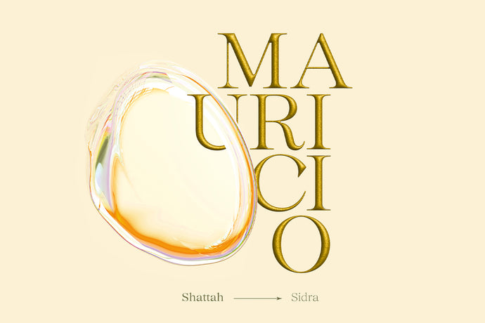
The result was the development of a new sub-brand - 'Mauricio' - which evolved with its own packaging concept and includes ten unique artworks created by Ari. These are exclusive, singularly printed and gifted to the first ten online purchasers of the coffee.
Take a look at the artworks and read our catch-up with Ari herself below.
How did you arrive at the concept for the Mauricio Shattah release?
I knew that we needed to find a visual system to represent this very special coffee release. The coffee is a limited edition and super premium, so I knew we would need to find a visually unique way to differentiate the product.
It's unique both from a flavour point of view and also in the level od detail and science which has been incorporated into the processing. With this in mind I initially began by exploring two different routes for design. In the first we explored the element of flavour and how this could be expressed to truly represent the coffee but also incorporate a sense of fun.
In the second route my focus was much more on the scientific side of this coffee’s journey [referring to the multi-stage fermentation process]. Here we took a lot of references from the world of science labs and images that you’d expect to see under a microscope.
This was the starting point for the visuals and from here we developed the concept further.
How did you settle on the individual design elements?
The typography takes inspiration from traditional notions of ‘luxury’, with it’s decorative serif tapers but we’ve created it in 3D to highlight the additional pattern of microorganisms within the letters to add texture.
For the bubble - the most challenging aspect of the project was to capture the flavour experience of mango. Intense freshness but creamy texture in one single image. For me the best way to represent this was with transparency and more watery texture than what we’ve done traditionally with Assembly. This is how I arrived at the idea of a bubble.
From here there was a lot of exploration and testing the bubble interacting with text, layout and colour to define how it would live among the other elements. Although I tried many alternatives we felt a cream background worked best visually and was true to the flavour experience of the coffee.
While the bubble is the focus point of all of the visuals, I’ve explored using the bubble layered with and interacting with other deign elements to elegant it among the design and ultimately give it more prominence
And the motion?
When you see the bubble static it naturally already feels as though it’s moving, so motion seemed essential in this sense. As an additional design element, introducing motion as a technique opened new possibilities in terms of conveying the flavour notes of the coffee as well as the texture, and balance of flavour.
As opposed to the regular illustrations we create for coffee there’s an additional element of tactility and transparency in this flavour illustration approach which actually made it easer to communise the flavour we wanted to highlight. The natural shape of the bubble has informed the ‘morphing’ of the motion while the lingering and prominent mango sweetness that defines the cup is being highlighted as the composition changes while it moves.
Ari is a senior creative designer with over a decade of experience. Her practice is multidisciplinary with a focus on visual identities, flexible brand systems, and graphic design. Visit her website here.